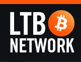

@jayek Take 2
I like this one too. I was working on something similar, but my wife said the "LT" part looked too much like "L7." Just my 2 Satoshis.

Tell your wife she's to hip for her own good. L7 , it's all I can see now too lol.


@jayek Take 2
I like this one too. I was working on something similar, but my wife said the "LT" part looked too much like "L7." Just my 2 Satoshis.
Tell your wife she's to hip for her own good. L7 , it's all I can see now too lol.
@angrycanuck Jay I like the first version a little better. This version is hard to read the lower text on mobile and it looks cramped.
Just my 2 cents I vote for the first version!
I changed the font size, type and colour on your suggestion and added a "!" for flair. Cheers!
Ok one more, I think I'm getting carried away with this.

@jayek Ok one more, I think I'm getting carried away with this.
K I do like this one however the eye goes straight to the top of the circle for the text and it sees...nothing. Rearrange the text so the key info is near the top so the eye can flow clockwise (like a picture left to right)
Make those changes and I think you have a winner :)
I'll give your suggestions a whirl this evening, Cheers.
Here are a few versions of a basic design for consideration. My goals with this design are:
-Utilize the current LTB branding (my sense is familiarity and cross-promotion of the brand is important)
-Create a design that fits with other major altcoins
@robmitchell Here are a few versions of a basic design for consideration. My goals with this design are:
-Utilize the current LTB branding (my sense is familiarity and cross-promotion of the brand is important)
-Create a design that fits with other major altcoins
I dig the silver one. Good job.
@robmitchell Here are a few versions of a basic design for consideration. My goals with this design are:
-Utilize the current LTB branding (my sense is familiarity and cross-promotion of the brand is important)
-Create a design that fits with other major altcoins
I think I like this one the most out of the new series. I dig it's minimalism.
@mich Alright. Here's my first submission. I consider all these the same logo. The basic elements are the same but stylized in different ways depending on what you would use it for.
This is my favorite so far. I like the fact that it resembles a record player with the notch on the left. As soon as you add the another notch on the other side, It loses that feel completely and becomes too noisy in my opinion :p
Has a broadcast wavey type of feel to it as well :)
Please Login to post a reply to this thread.